my process and notes
Here I will detail how I made certain pieces. Not everything will have comprehensive notes, as honestly, this is more for me to remember how I made stuff. Unfortunately, I have really fucking shitty memory. If anyone has any questions that I did not answer here, please feel free to email me.
2026JUNE03 - design for my little brother's graduation cap
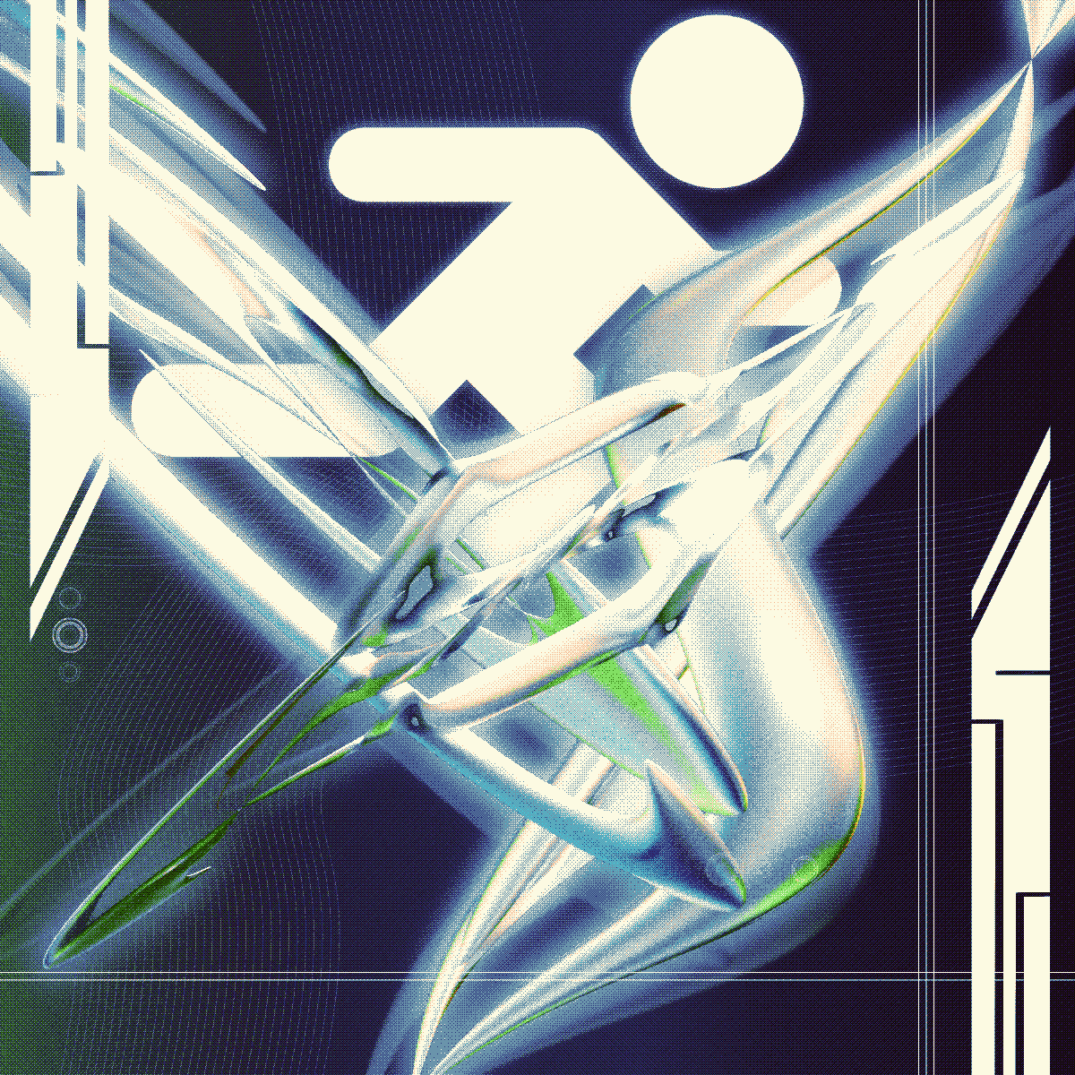
My little brother is graduating high school soon, and he was notified a mere week before his graduation that they would be allowed to decorate their caps. In the moment, I offered to make one for him!
For awhile, I've been wanting to make a return to doing metalheart art but haven't been sure what direction to go again. What's been holding me back is that I am not the best at using shader nodes in Blender, and that's what I think would take my renders to a new level. Being afraid of the lighting and shading is kind of lame, but I will get over it with time, I think. I just need to keep trying new things.
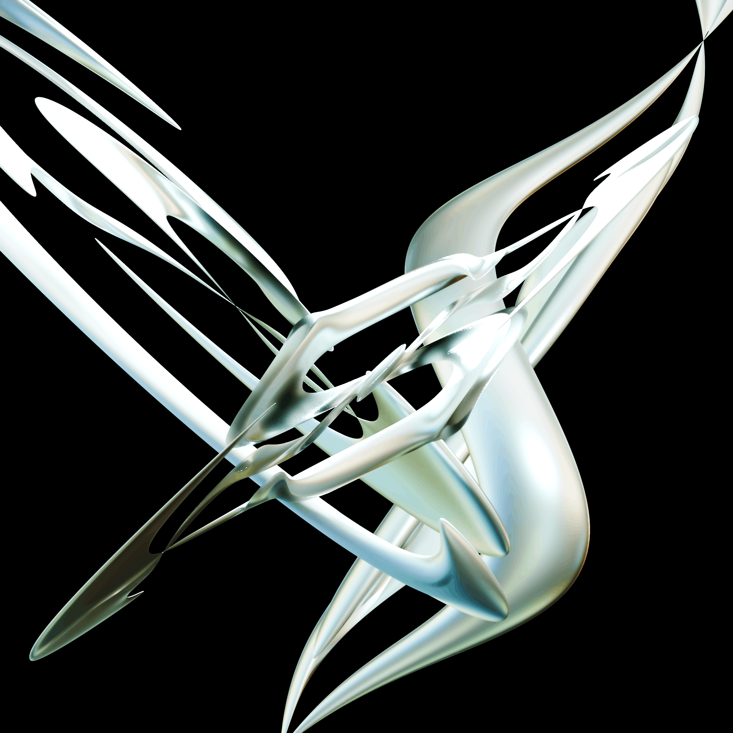
For this piece, there are three torus meshes that have several simple deform modifiers on each of them. They all have the same material and only one light exists within the original scene in Blender. The photo above has the render with the background set to black, but for the background I left transparent so I could drop it into Krita and make a gradient background myself.
I thought it would be smart to find a way to just create a background for the meshes in Blender, but my workflow for these sorts of pieces is usually just 1) make the render first to define the comp and then 2) edit the render further in Krita. For this piece I started with deciding on the palette, which would be like blue into green, shades of teal and dark navy and such as those are used at his school. Then I wanted to make the piece feel crunchy, so a texture filter was added to all the layers with the render using a stronger noise percentage.
To make the render feel a little ghostly and "in motion", the render layer was duplicated once for an additional blur layer and once again so that the render could be scaled up, slightly rotated, and have its opacity lowered.
Adding the guy running was important to me because my little brother's sports are cross country and track and field. Those sports have been a big part of his high school experience, and I thought it would be a fun addition. What can't be seen here is that I added text, such as his name and graduation year, but of course I'm not going to leave that up here.
2026MAY29 - poster for OBSIDIAN GARDEN: TEMPEST VIII
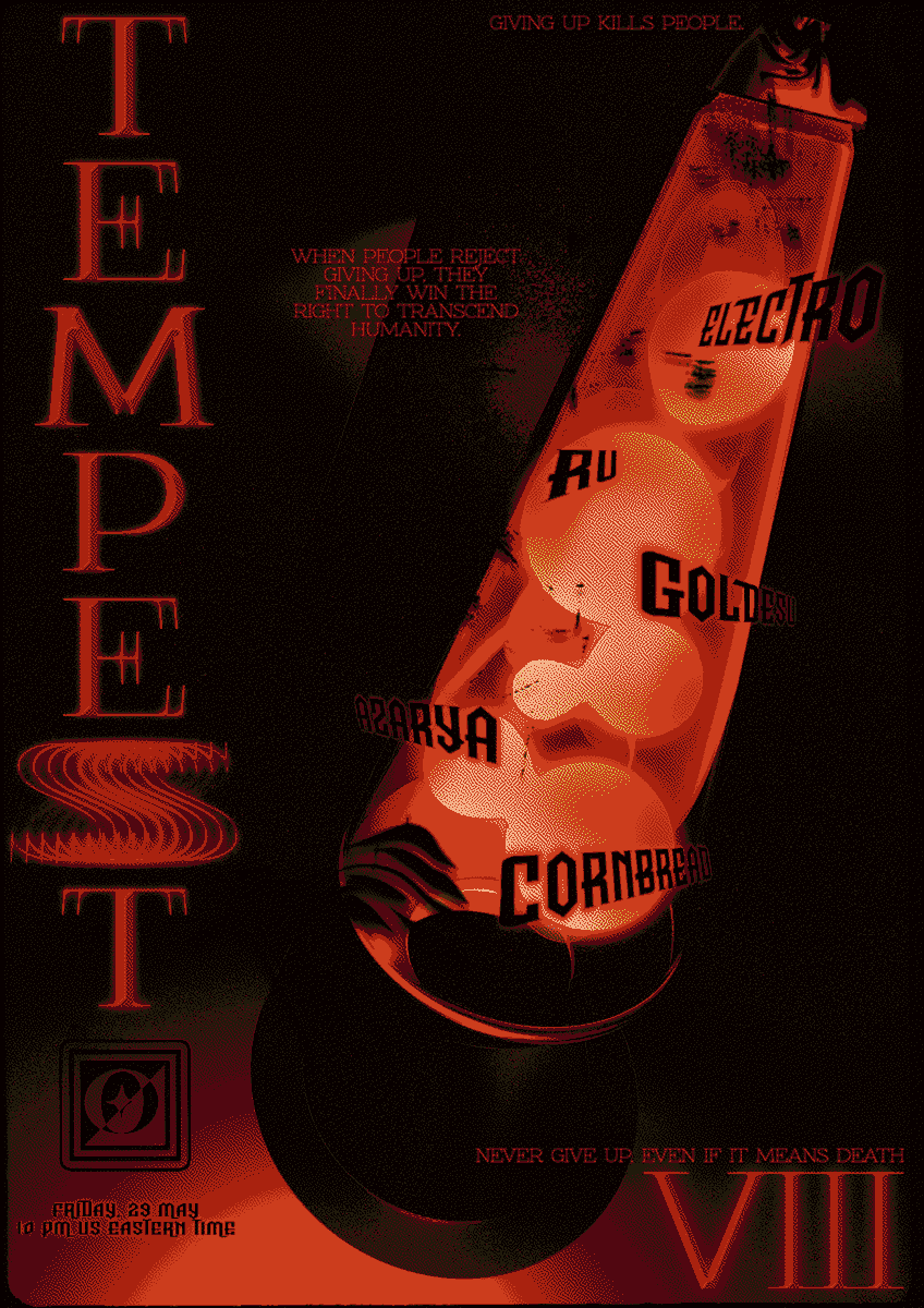
I have had the great pleasure of working with Obsidian Garden for nearly a year now, with Dragon Butt - one of the event coordinators for the virtual venue - being my main contact for every piece I've made for them. Dragon let me know that for this event, they wanted the following: "I'd like a lava lamp poster this time!"
... and that's it. I love them! lol
It's really cool that Dragon and the rest of the staff over at OG trust my vision so much that this was their only noted request. I decided to give rendering in Blender another go, thinking of making a lava lamp with emissive goo balls inside. OG is known for their red theming, so I kept that in mind when thinking of the overall comp. My overall vision was that first, I must make it really dark with the lava lamp as the focus, and second, I'd like a lot of negative space to work with to put the event text with all the relevant information. I've found that keeping really simple goals before going in helps me center myself. I write these down and keep them in front of me while I work.
Currently in Blender I'm on version 5.1.2. Creating the lava lamp can be done with starting off with a circle and simply extruding them and scaling the extrusions to fit the shape of a lava lamp. The mesh can be separated into two materials, with one portion being "glass" and the other being "metal". To create contrast between the lava lamp and the space around it, I put two planes in the scene - one directly below the lava lamp for it to "rest" on and one slightly behind it.
For us to see the contrast between the lava lamp and the space around it, a few lights needed to be added. There are only two lights: one just above the lava lamp and one a little bit inside the lava lamp but towards the bottom. The top light points downward, the bottom light points upwards and into the lava lamp.

I decided to go with red and orange being the colors for the top and bottom lights, respectively. The top light I had angled so that it would show off the red "metal" and cast a shadown of the lava lamp onto the background.
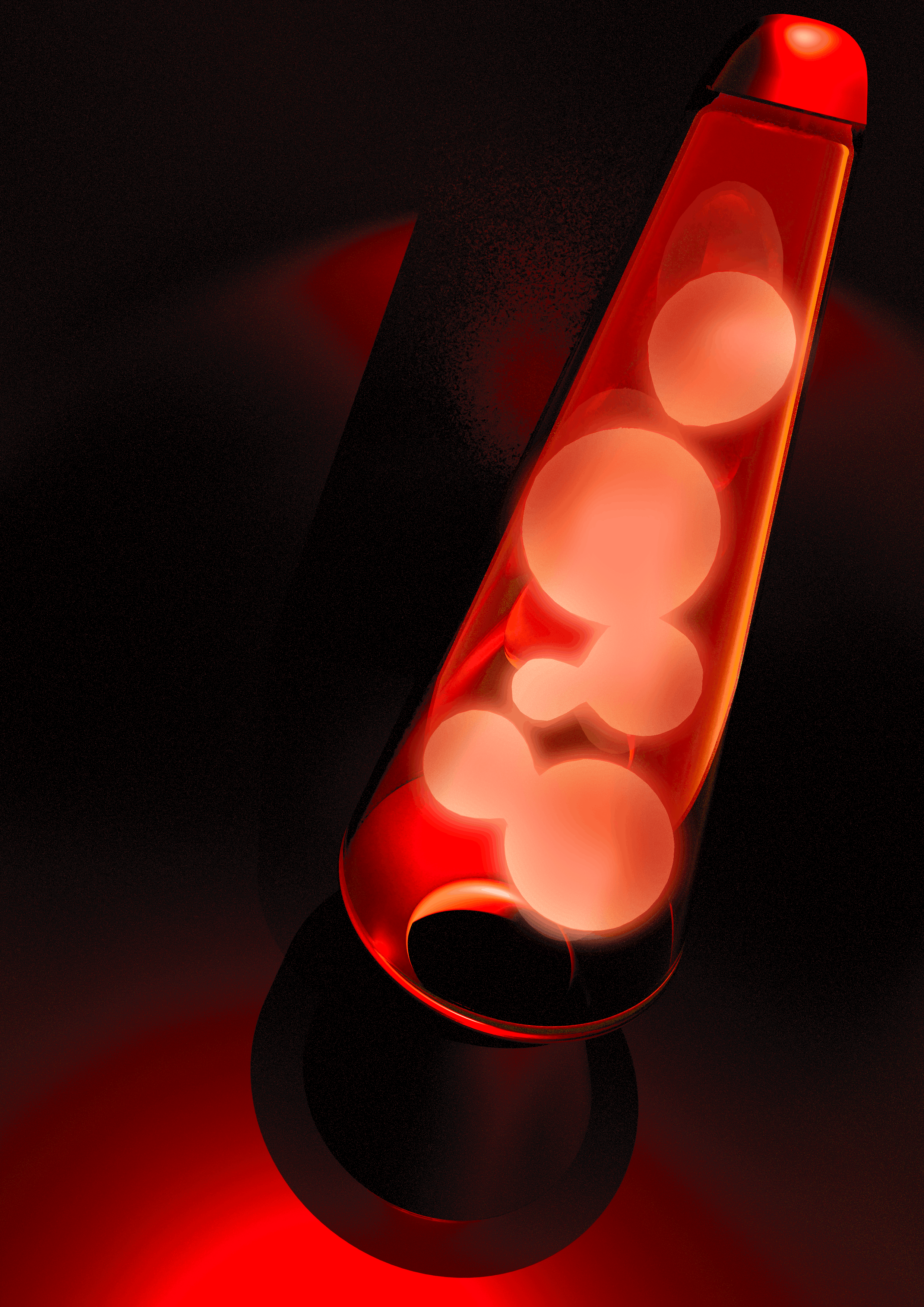
Several metaballs were added to create the goo balls inside the lava lamp. I had to increase the subdivision as in my earlier renders, you can see the shading break up a bit. What I would have tried to do differently here would be to duplicate the metaballs and somehow animate them, but I didn't want to go through all the trouble. Perhaps another day, because I want to learn how to do so properly. I also wanted to figure out how to make the goo balls seem more blurry in the render, but instead I decided to just figure out how to do it in post.

The shading breaking up can be seen in the render above. I also did not really like the composition of this, as you cannot see the shadow of the lava lamp or any sort of contrast with the lava lamp and the background that is supposedly behind it.


I still wasn't exactly pleased with how the goo balls looked like inside of the lava lamp, so I opted to create a mask for the goo balls by removing everything else in the scene in Blender except them for a render. There are probably easier ways to do this through Blender but let a guy do his thing.
Despite the goo balls, I was still rather pleased with the render. I took it into Krita and edited the png I got first. My rule is that I must have some sort of intense contrast so that the viewer is not struggling too much to pick up details about the piece. I liked the final render, but wanted a much more severe contrast between the red of the light and the dark background. I wanted to show off how much red was present, and I also wanted to find a way to make the inside of the lava lamp seem to "glow".
My solution was to use the mask I got from Blender to have only the portion of the goo balls selected and able to be painted in. I used the gradient casted on the metaballs by the two lights present in the scene in Blender to guide me, colorpicking from the original photo to paint over the goo balls. I painted a softer gradient, then duplicated the layer and put a gaussian blur filter over it. I duplicated the layer again and warped the goo balls to be slightly ajar, then put that layer underneath the painted layer and the blurry layer, finally setting it to half opacity.
With doing this, I hoped to achieve the feeling that these balls were moving rather than being static. As pleased as I am with the final result of the background of the poster, I still think that the goo balls seem a bit too "firm" or "stuck in place".
Anyways. The final background for the poster was complete, and I really enjoyed the process of making it. For future projects, I want to continue challenging myself with Blender as I have been spending way too much time in Unity lately.